Headspace Redesign

Roles
Researcher
Designer
Tools
Figma
Project Duration
3 weeks
Challenge
Results
Goals
Informative
Create an interface that properly informs users and empower their mindfulness practice.
Efficient
Develop UI that presents clear content organization to reduce browsing time.
Tailored
Create a solution that includes content that users love and will regularly use.
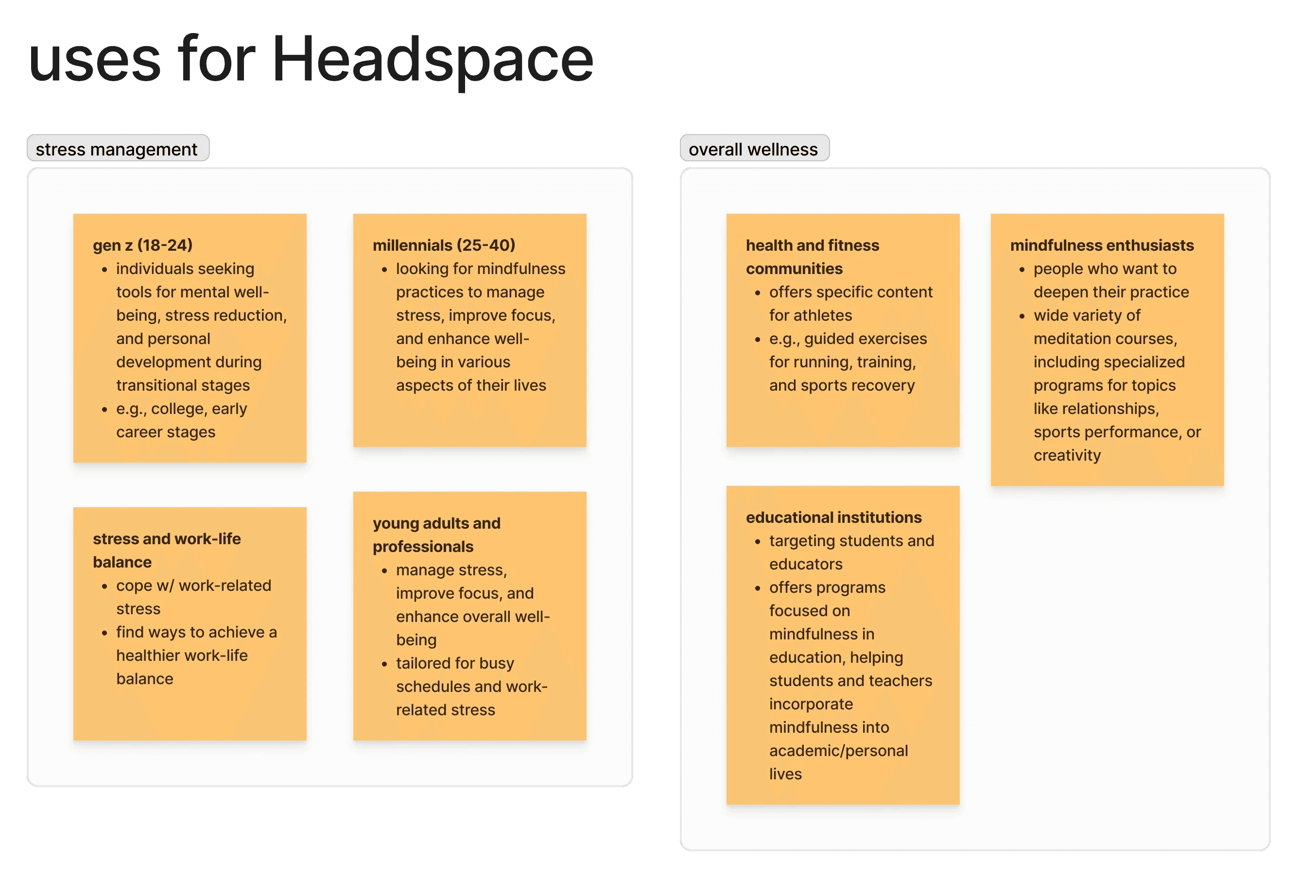
Research
I conducted online research about Headspace, its target demographics, and most common uses. After reading various articles and case studies on Headspace and its business model, I compiled my findings into an affinity map and grouped them based on common pain points and use cases. To validate my findings, I did an online ethnography on various Reddit forums to find the most prominent pain point from my research.
Affinity Mapping
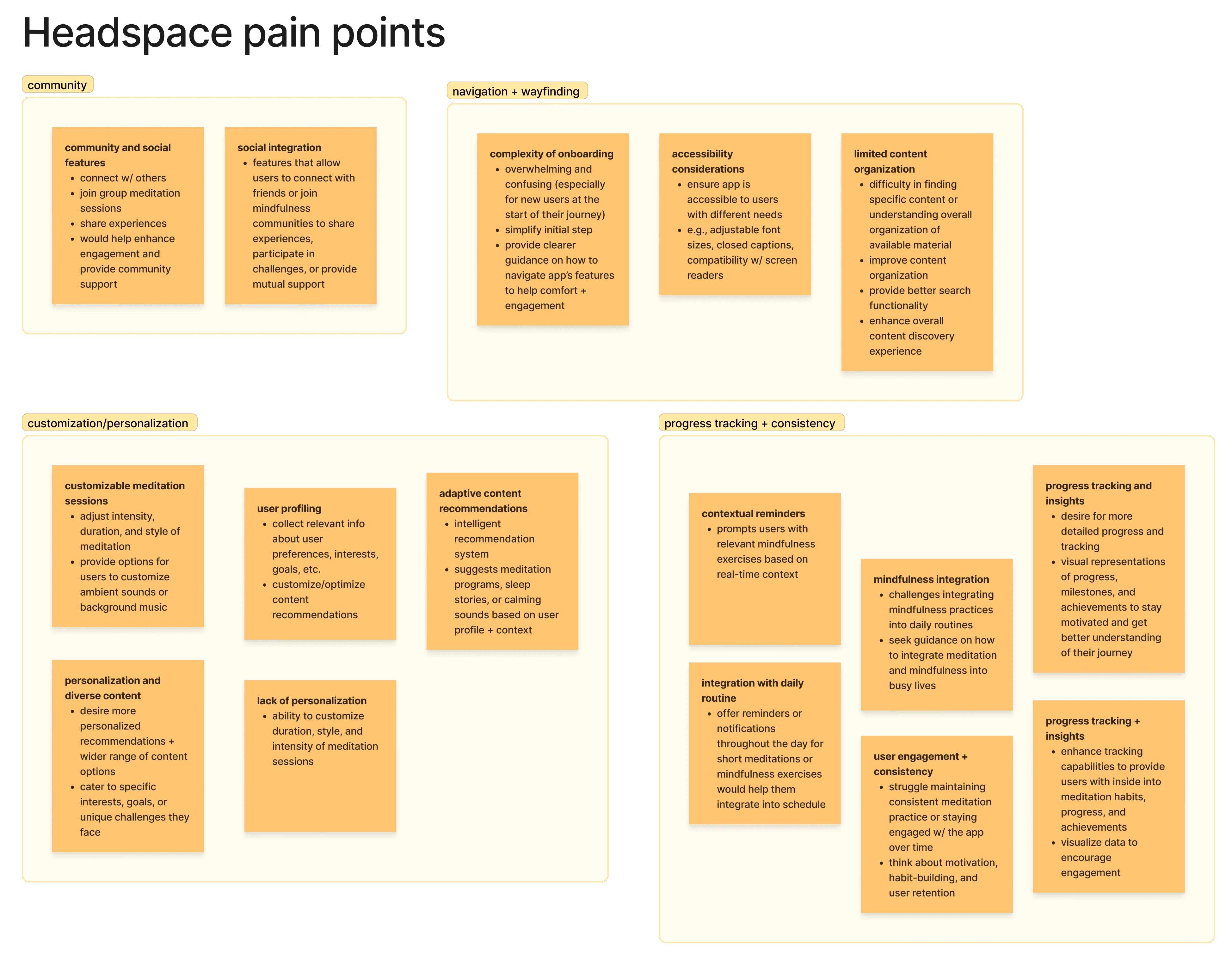
Online Ethnography
Research Analysis
Headspace is hard to navigate, preventing users from finding available content or exploring new offerings.
The current interface is too crowded with content and distracts users from engaging in mindfulness.
Users want to better informed of available content so they can choose the practice that best fits their needs.
Interface Analysis
Search Page (landing)

Search Page (results)

Defining
Before starting the design process, I did a 5 Whys exercise to further refine the issue. This also helped me create a Problem Statement and a HMW statement to guide the direction of the design.
Problem Statement
How might we…
Wireframing
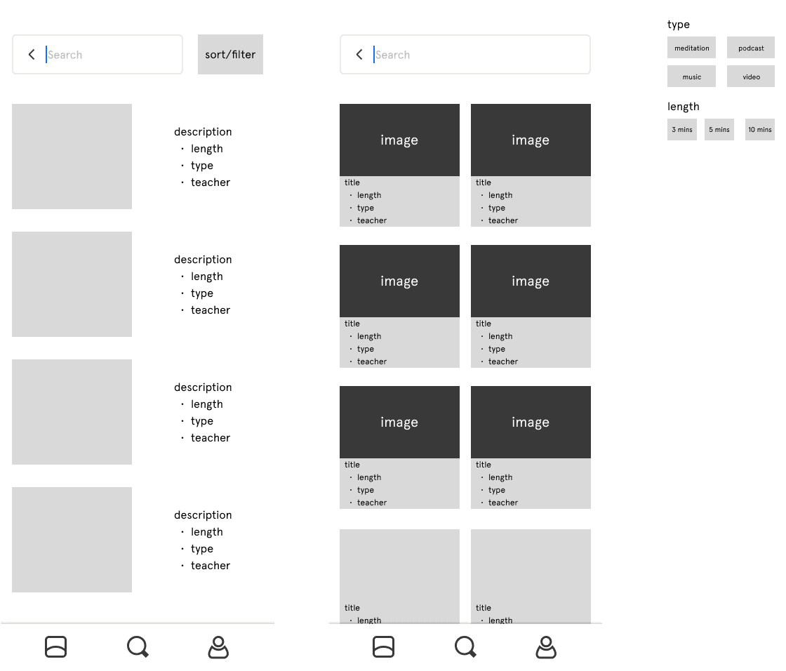
I focused on the issue of content crowding and wanted to create an interface that would better inform users of available content. For the landing pages, I reduced the amount of suggestions displayed to minimize choice paralysis. On the results pages, I created two different layouts that better displayed metadata (i.e., title, duration, media type).
Usability Testing
After drafting low-fidelity wireframes, I created mid-fidelity wireframes for user testing. I presented users with three layouts of the landing and results page and asked them to which layout had the best clarity and organization.
Search Landing

Search Results

Final Design