
AsLived

What?
A listing comparison tool that provides personalized, in-depth summaries that help movers quickly evaluate how each listing fits to their lifestyle.
For who?
Young movers who are on a time crunch when searching for their new place.
My role
End-to-end UX designer responsible for research, flows, and UI design.
Project duration
7 weeks
Tools
Figma
Why This Matters
Choosing a place that fits movers' needs is difficult and gaps in expectation can make it harder to adjust.
Many movers face a discrepancy between their expectations of their new environment and the reality. Learning why these expectation gaps occur can help me provide better information to support the moving process and help movers better adjust to their new environment.
What Movers Need
Increased confidence in their housing decisions
Honest, informative summaries of the listings they're interested in
Reduced search complexity
The Solution
A listing comparison tool that provides personalized, in-depth summaries that help movers quickly evaluate how each listing fits to their lifestyle.
How I did it
Understanding the Moving Process
28 responses
I created a short survey to gather insights on people's moving experiences, collecting 28 responses in 24 hours.
15 questions
The survey had a total of 15 questions. These were broken down into the before, during, and after phases of moving
Survey Insights
Theme 1: People tend to prioritize proximity to amenities and connections to community when they move.
Theme 2: Gaps in expectation are a common pain point among survey participants.
Theme 3: Focusing on the "before" and "after" phases of the move would provide the best insights on how gaps in expectation occur.
Talking to Movers
16 questions
My interview guide had 16 primary questions with 1-3 probing questions each. I also asked follow-ups as they arose in the conversation.
9 insights
After consolidating my interview data into affinity map findings, I came up with 9 major groupings that informed ideation and design.

Interview insights
Movers rely heavily on opinions from real, trusted people to decide on a location, find go-to spots, and get a better sense of day-to-day life.
Listings can often be misleading, making people doubt their choices after they've moved.
Movers often feel rushed during the moving process and feel that having more time would make them feel more prepared and confident in their choice.
User-Informed Personas


Problem Statement
I want to explore ways to help movers get information about their desired place quickly because they often have limited time to search and make a decision, creating even more pressure to commit to a place that may not fit all their needs and expectations.
How might we…
make the search process quicker and more informative for movers so they feel more confident in their decision after they've settled in their new place?
Why a Comparison Tool?
Playing With Opposites
I started brainstorming using the "playing with opposites" exercise to generate "bad ideas" as a base to come up with more helpful solutions. At the end of the exercise, I grouped similar ideas into an affinity map.


The Idea: Comparison Tool
I decided that a comparison tool would be the best solution. Having an organization and comparison tool directly on the listing site can help reduce unnecessary time cross-referencing tools. It can also help provide quick summaries that users can easily glance over.
This kind of tool would be helpful for users like Oliver who get overwhelmed with the back-and-forth comparison between resources. This would also be helpful for users like Tracy who have limited time to search and lock down their leases.
What Are Movers' Search Criteria?
Card Sorting
To prepare for the design process, I conducted a card sort to learn what information is most important to users when they're searching for a new place and would need to be added to the comparison feature.
Provided with a list of 57 cards, I asked participants to sort the cards in one of three categories: Most Important (i.e., must-haves), Somewhat Important (i.e., nice-to-haves), and Least Important (i.e., not considered).

Card Sorting Takeaways
Takeaway 1: Basic information like rent and listing specs are highly valued and should be clearly stated.
Takeaway 2: Overall safety and security is an important part of people's criteria that may outweigh other amenities.
Takeaway 3: Proximity to frequently visited places is a top priority for movers and should be accounted for in their comparisons.
Early Explorations
Increasing Fidelity
Prototyping
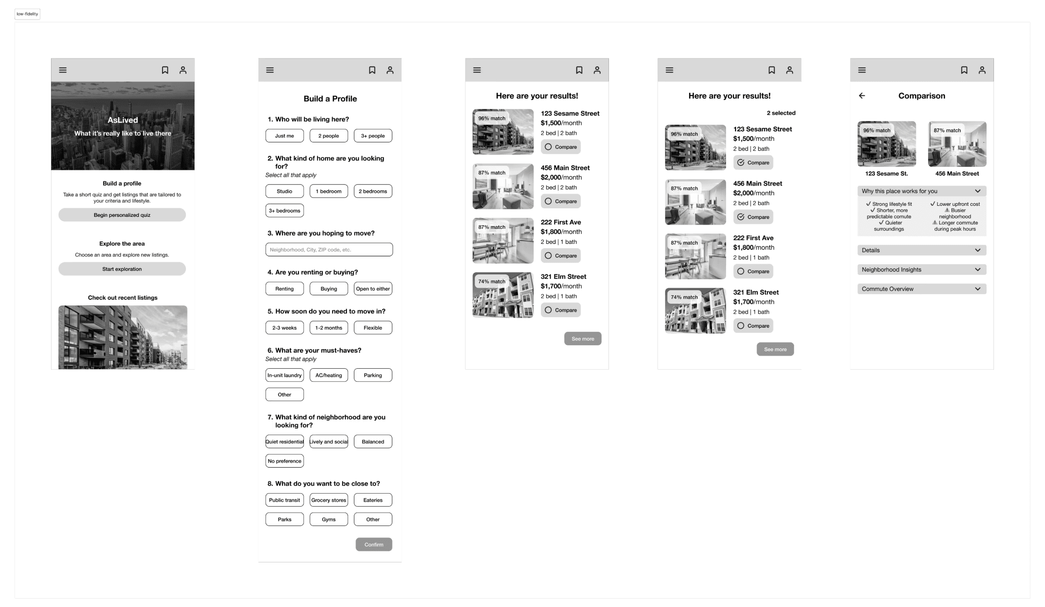
Using my component library, I designed a high-fidelity prototype that included a personalized intake quiz, quiz results, and a comparison table with filters.

Intake Quiz

Quiz Results

Comparison table
Validating With Users
Usability Testing
I asked my 5 testing participants to complete 3 tasks to evaluate the quality of the personalized quiz, the clarity of the sites's layout/navigation, and the effectiveness of the comparison tool.
Task 1: User takes the personalized quiz to get tailored results, then navigates to the comparison page to evaluate listings.
Measures of success:
Participants' first action is to navigate to the personalized quiz
Participants can complete the personalized quiz without confusion
4/5 participants
took the personalized quiz as their first action on the site
Task 2: User navigates to the saved listings page and compares two listings.
Measures of success:
Participants can navigate to the saved listings page on the first try
Participants can successfully reach the comparison table from the saved listings page
2/5 participants
were able to find the saved listings page on their first try
Task 3: User changes the criteria on the comparison page using the filters.
Measures of success:
Participants choose the filter button to change the criteria
Participants can find the new changes once the filters have been applied
4/5 participants
were able to successfully apply the filters and find the new changes
Priority Revisions
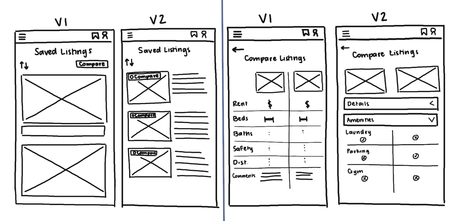
Saved Listings Icon
Many participants found it hard to find the saved listings page because the icon was small on their screens. Since the home is more prominent in the initial design, participants mistook the icon for the home button. I decided to make the heart larger and more noticeable as the saved listings icon.

Before

After
Personalized Quiz
I added new questions to the intake quiz based on user feedback. The new questions are better suited for movers' needs when searching for a new place.


Sticky Scroll
I noticed that participants had some difficulty deciphering what information belonged to each listing. So I made the listing cards stick to the top of the page so they were visible as users scrolled through the table.
Before
After
Comparison Table
I made revisions to the comparison table to provide users with a better presentation of information that is easier to scan and quickly comprehend.


The Final Design
Introducing AsLived
AsLived is a listing comparison tool that provides users with personalized listing recommendations and comparison details.
Get Personalized Listings
Users can take an intake quiz to get personalized listings that match their lifestyle. Users can also see how well listings match their search criteria.
Compare Listings
Users can choose listings to compare and get in-depth summaries of what life looks like in each neighborhood and how well the listings fit their needs.
Reflection
Overall, this process taught me the importance of communicating with users. My assumptions changed many times throughout this project, but relying on my discussions with users in interviews and testing sessions allowed me to create an informative, personalized product.


