Habit-Driven Career OS
The project
Designed the first public-facing iteration of Leeg's career growth platform, focused on improving clarity, engagement, and meaningful growth for professionals seeking structured, motivating, and actionable personal growth support.
My role
Collaborated on a two-person UX team to lead product strategy, interaction design, usability testing, and high-fidelity UI design.
Project duration
5 weeks
Tools
Figma
Claude (research synthesis)
Notion AI (transcription)
Why this matters
Leeg was built to add structure to career growth, but the experience wasn't making it easy for users to build the habits the platform was designed around.
What Leeg needs
Clarity before engagement: Users need to understand the product before they can build habits inside it.
Guided momentum: Every interaction needs a clear next step that keeps users moving forward without decision fatigue or choice paralysis.
Meaningful feedback: Users need to feel their actions are building toward something real, not just completing tasks.
The solution
We transformed Leeg into an intuitive and motivating growth experience by simplifying user flows, clarifying insights, and helping users connect daily actions to long-term career development.
Project Kickoff
What is Leeg?
Leeg is a career development platform built on the idea that consistent daily habits compound into meaningful professional growth over time. The platform is anchored by three core features:
Journaling — daily reflections that capture what energized, challenged, and taught the user each day
Boosts — bite-sized learning moments that build skills through focused, actionable exercises
Goals — a system for setting and tracking long-term professional development targets
Experiencing Leeg firsthand
Before starting the design process, my teammate and I each walked through the existing app independently, experiencing it as a first-time user would.
Friction points
Theme 1: Consistency gaps in the onboarding create cognitive friction
Theme 2: Dashboard lacks personalization and momentum signals (e.g., no streak, no goal context, no CTA)
Theme 3: Feedback moments need to feel like coaching, not UI. Onboarding should feel warm and intentional.
Defining the problem
POV statement
Growth-oriented professionals need engagement that feels useful in the moment because they are more likely to stay motivated when each interaction helps them clarify direction, not just consume content.
How might we…
build a clear, motivating daily engagement experience that makes users feel rewarded and connected to their progress?
Research & Strategy
Literature review
Leeg provided two user archetypes to frame their target audience: the Ambitious Builder (18-35, early to mid-career) and the Recalibrater (30-45, mid-career). Both are motivated to grow but struggle to translate that into consistent action.

What are competitors doing?
The Leeg team pointed us toward Duolingo, Strava, Headspace, Calm, and Linkedin as reference points.
Duolingo, Headspace, and Calm were the most instructive. All three platforms employed design patterns that guided users toward a clear next step and made progress feel tangible.


Setting the visual direction
To bridge research and design, I compiled visuals from competitor platforms that highlighted the specific patterns we wanted to bring into Leeg. Combined with my teammate's findings, this gave us a shared visual language to work from and a concrete artifact to present to the client.

Moodboard
Mapping the experience
Before moving into wireframes, I mapped out two user flows to establish the foundation of the experience: one reframing onboarding as a profile-building experience, and one outlining the daily engagement loop.


Research takeaways
Theme 1: The Ambitious Builder is the user to design for. Structuring the experience around their need for guidance, momentum, and meaningful feedback would serve both archetypes without alienating either.
Theme 2: Clarity is a prerequisite for engagement. Users cannot build habits inside a product they cannot navigate confidently.
Theme 3: Successful habit loops are guided, not open ended. Duolingo, Headspace, and Calm all removed the burden of deciding what to do next. Leeg needed to do the same.
Exploration
We focused our lo-fi wireframes on the areas most critical to the daily engagement loop. After aligning with the Leeg team on lo-fi wireframes we moved into high fidelity, refining the experience through multiple rounds of iteration in close collaboration with the Leeg team.
While goals, profile, and career insights were secondary to the daily engagement loop, the Leeg team recognized the need to bring those features into the hi-fi prototypes to create a more holistic experience.


Testing the Experience
Independent testing
My teammate and I each conducted separate rounds of usability testing with a total of 11 participants. We synthesized our findings independently before aligning on core issues together.
5 stages
Our testing process focused on the platform's most important interactions: onboarding, daily engagement, goal-setting, career profile insights, and A/B testing of layouts and interaction patterns.
Key insights
Insight 1: ~70% of all usability issues stemmed from unclear language or expectations, confirming clarity as the primary problem
Insight 2: Participants consistently preferred Boosts and Goals over Reflections, which felt effort-heavy with an unclear payoff
Insight 3: Insights were universally seen as valuable but overwhelming in their current form
Insight 4: Users expected guidance and direction but the product required self-interpretation, creating a significant mental model gap
Priority Iterations
Iterating for clarity
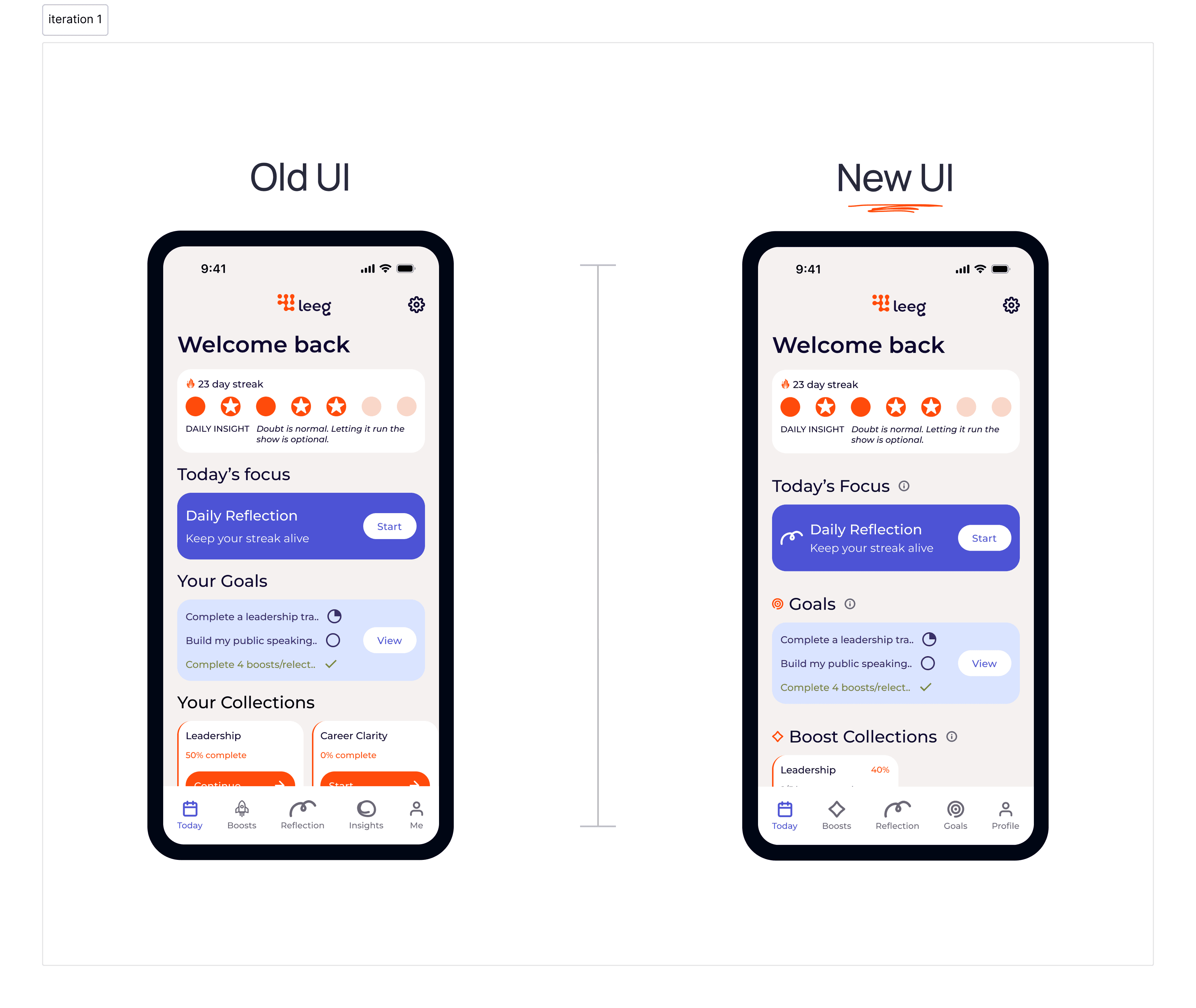
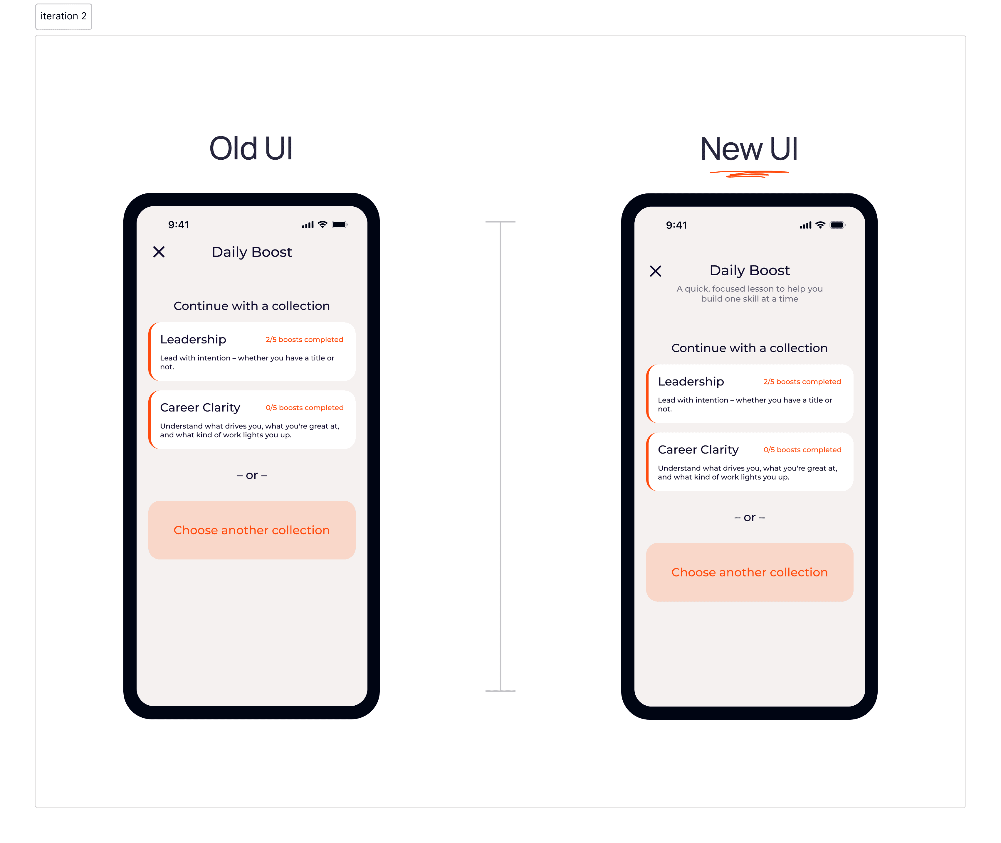
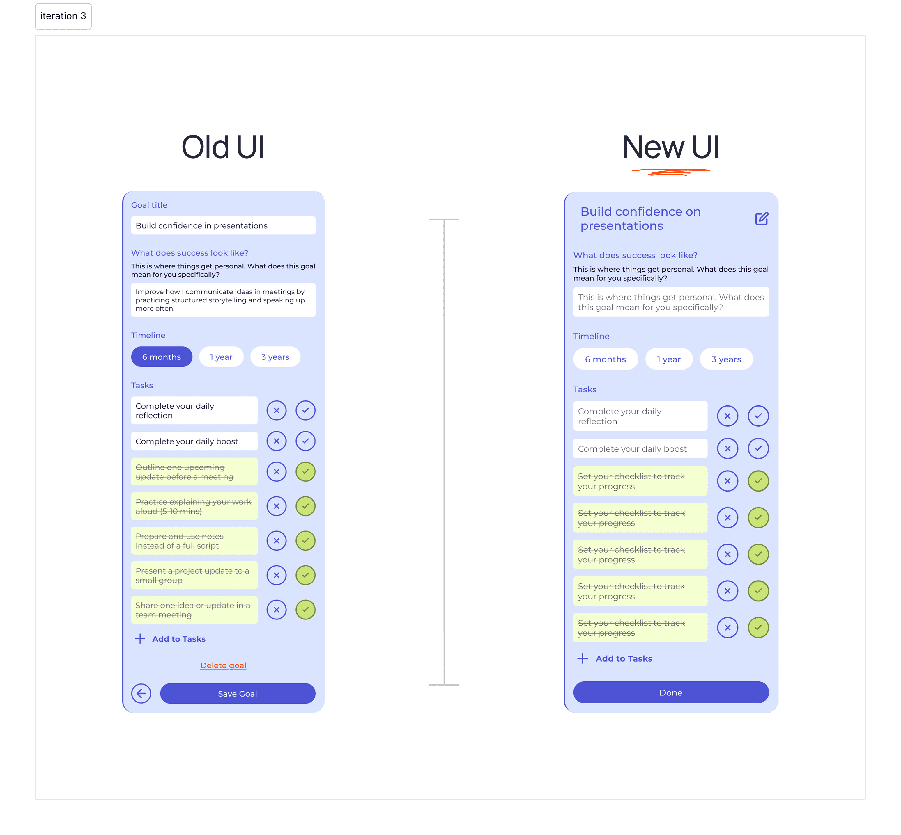
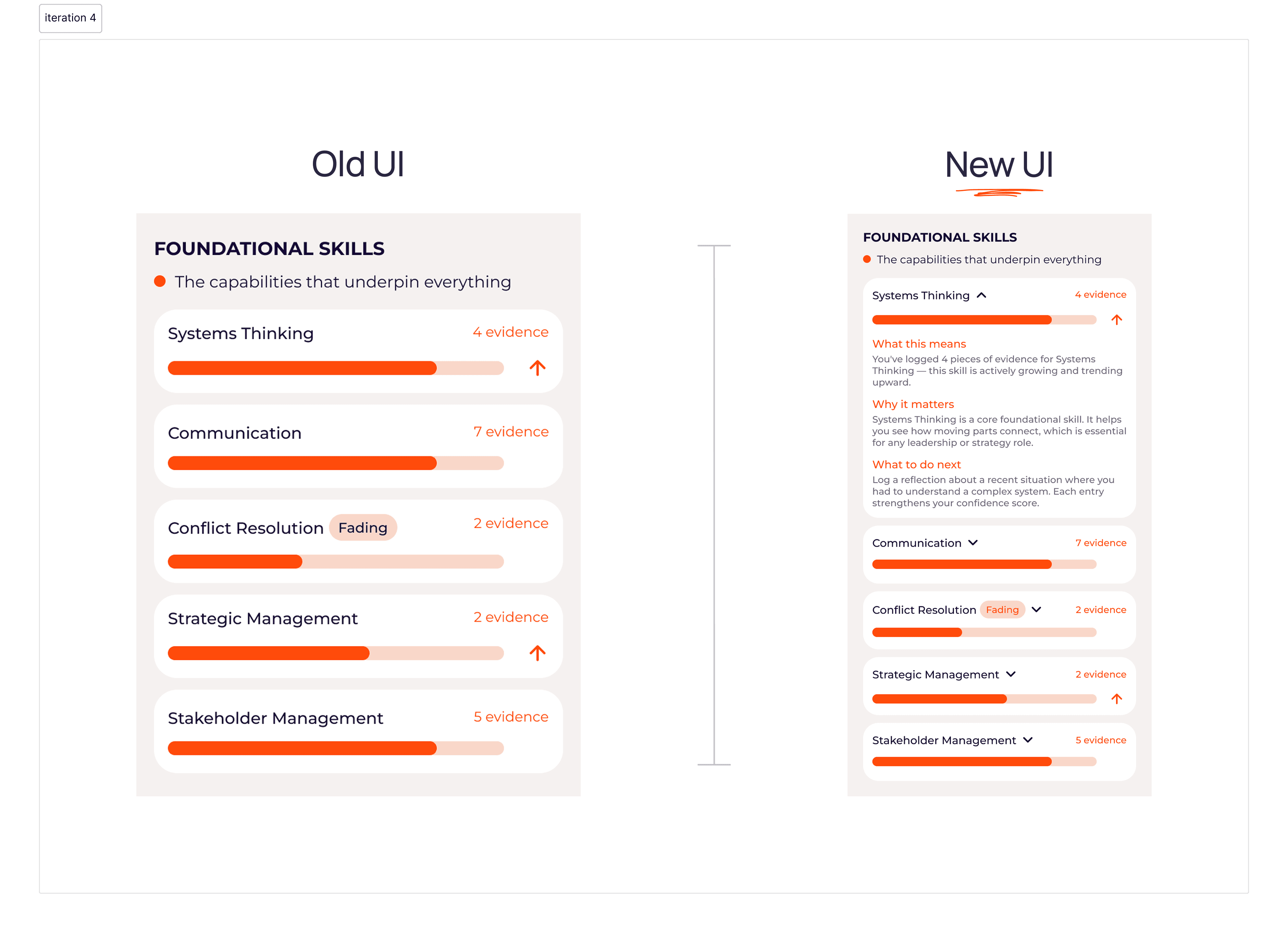
The majority of our changes focused on clarity. We added contextual guidance, descriptive headers, and clearer visual differentiation between interaction states to reduce the language and expectation gaps that surfaced most frequently during testing. These changes aimed to help users orient themselves without tedious trial and error.
Iterating for action
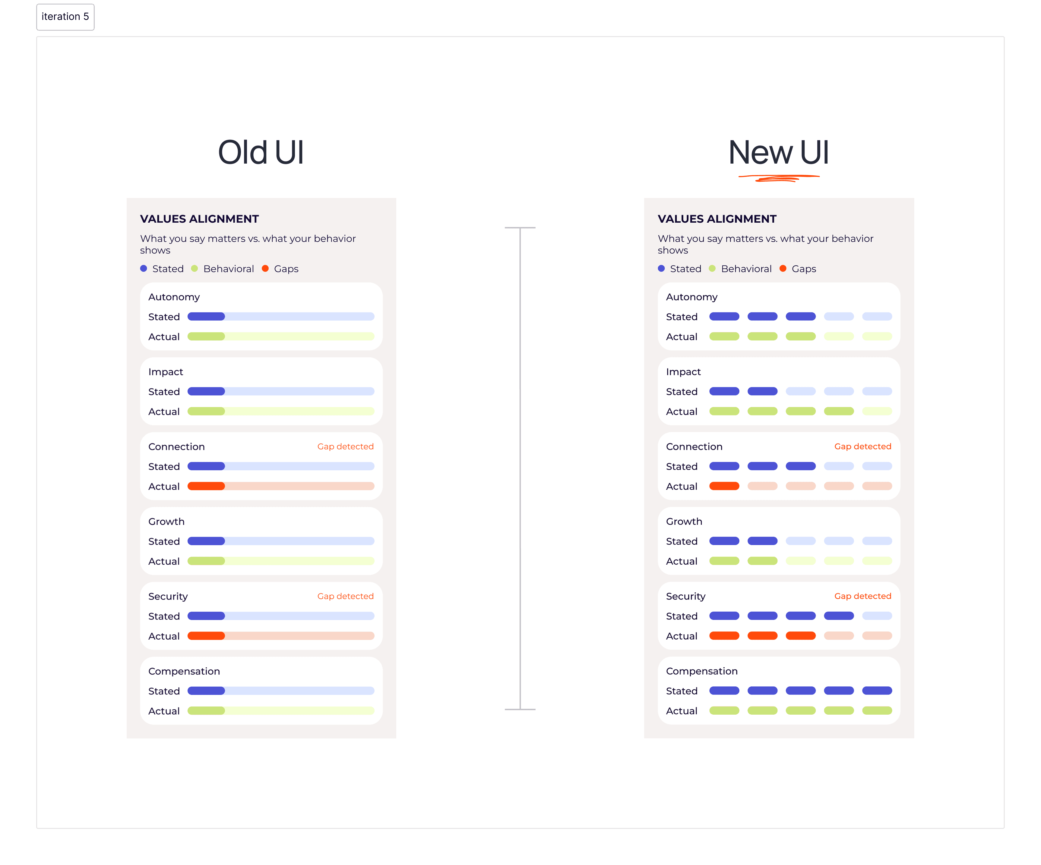
Our other major iteration addressed actionability. Rather than presenting insights as static summaries, we redesigned the experience to surface next steps and personalized recommendations, giving users a clearer sense of what to do with what they were seeing.
Final Design
What started as a product users could easily get lost in became one that guides them at every step.
Through a restructured onboarding experience, clearer daily engagement loop, and insights summary that tells users what to do next, we gave Leeg's users a clear sense of where to go and why each interaction was worth their time.
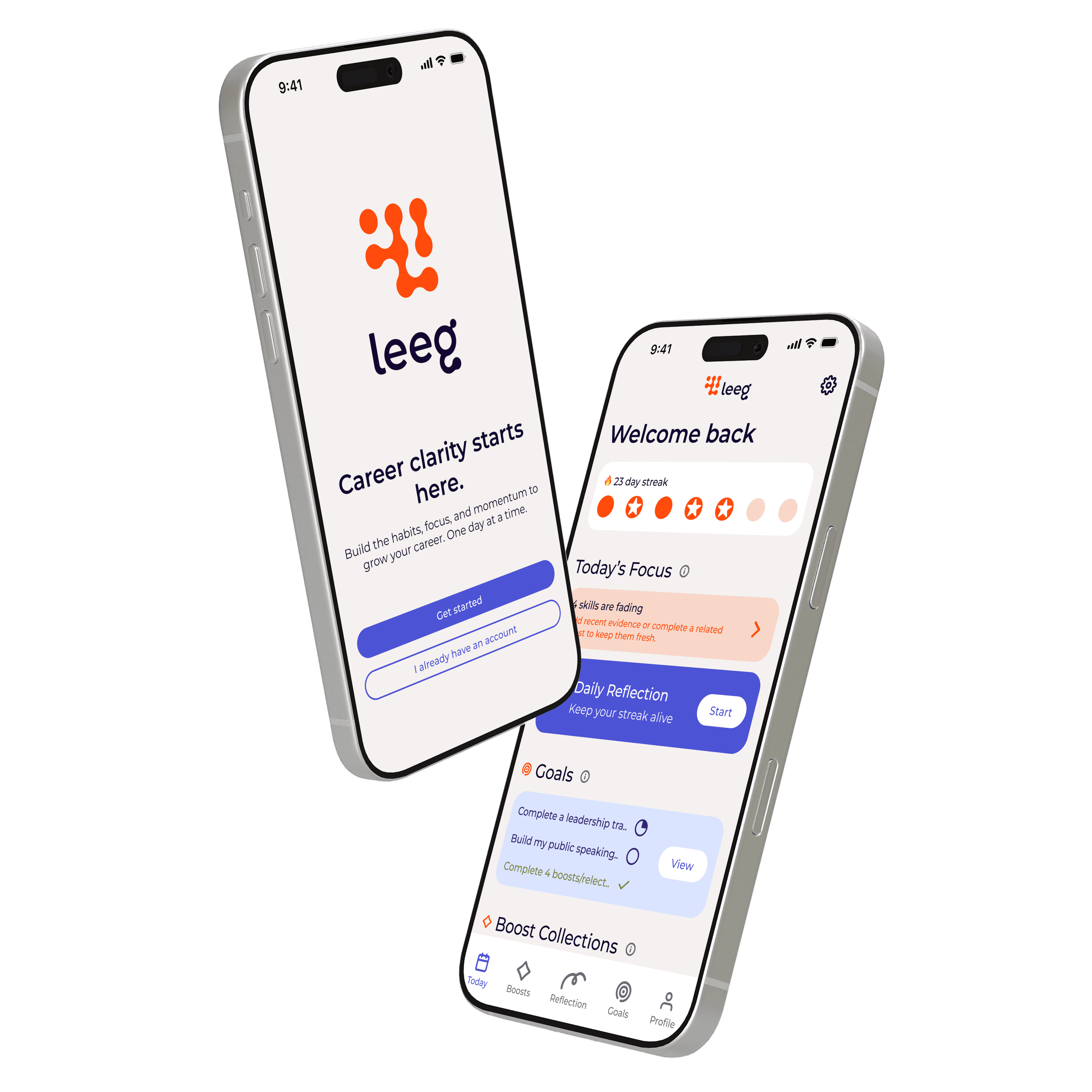
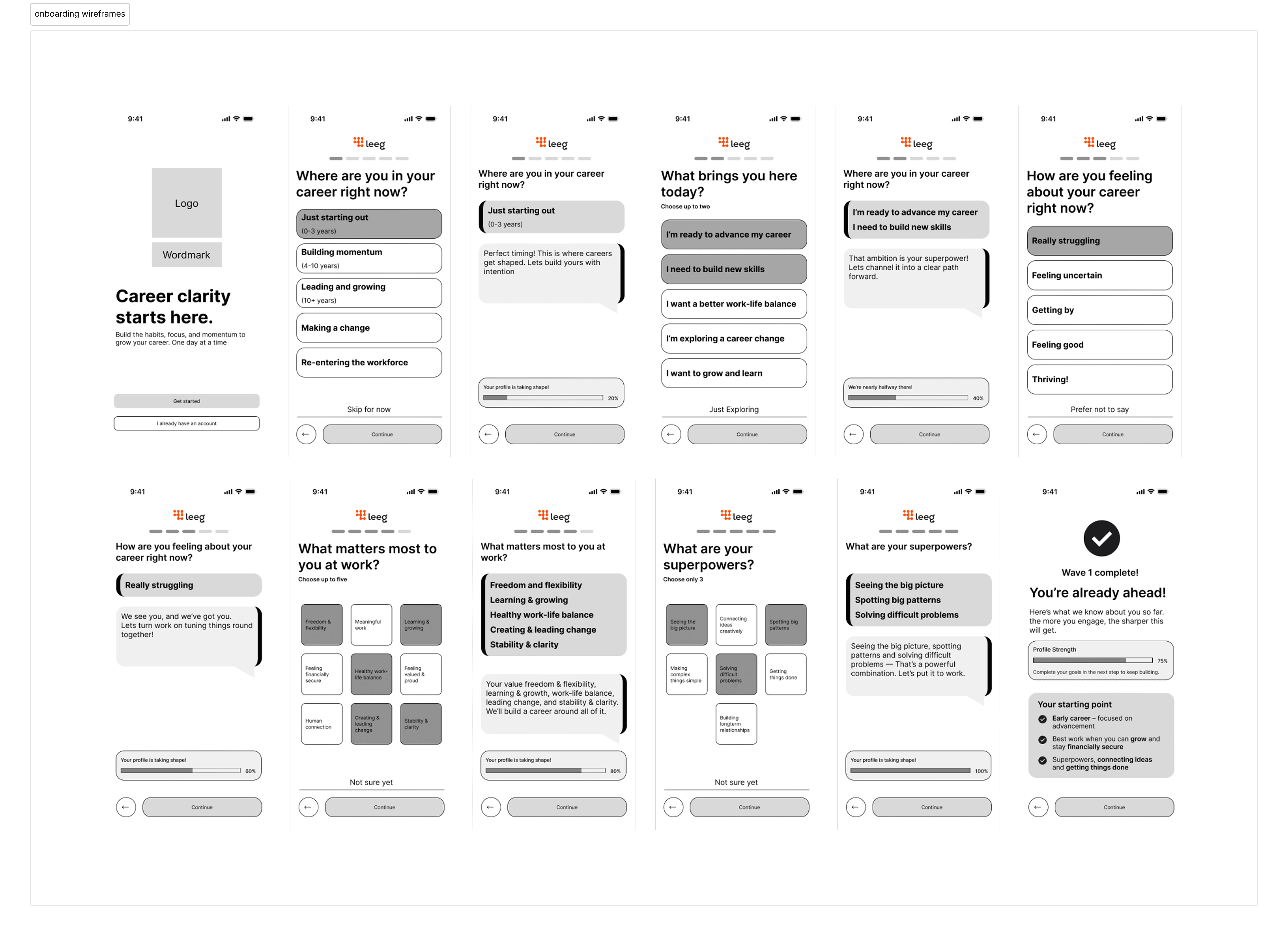
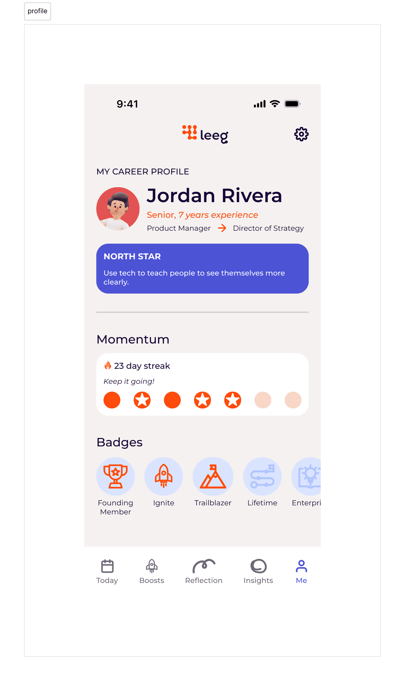
Personalize your growth journey
Users share their career stage, goals, and growth areas to create a more tailored and supportive development experience from day one.
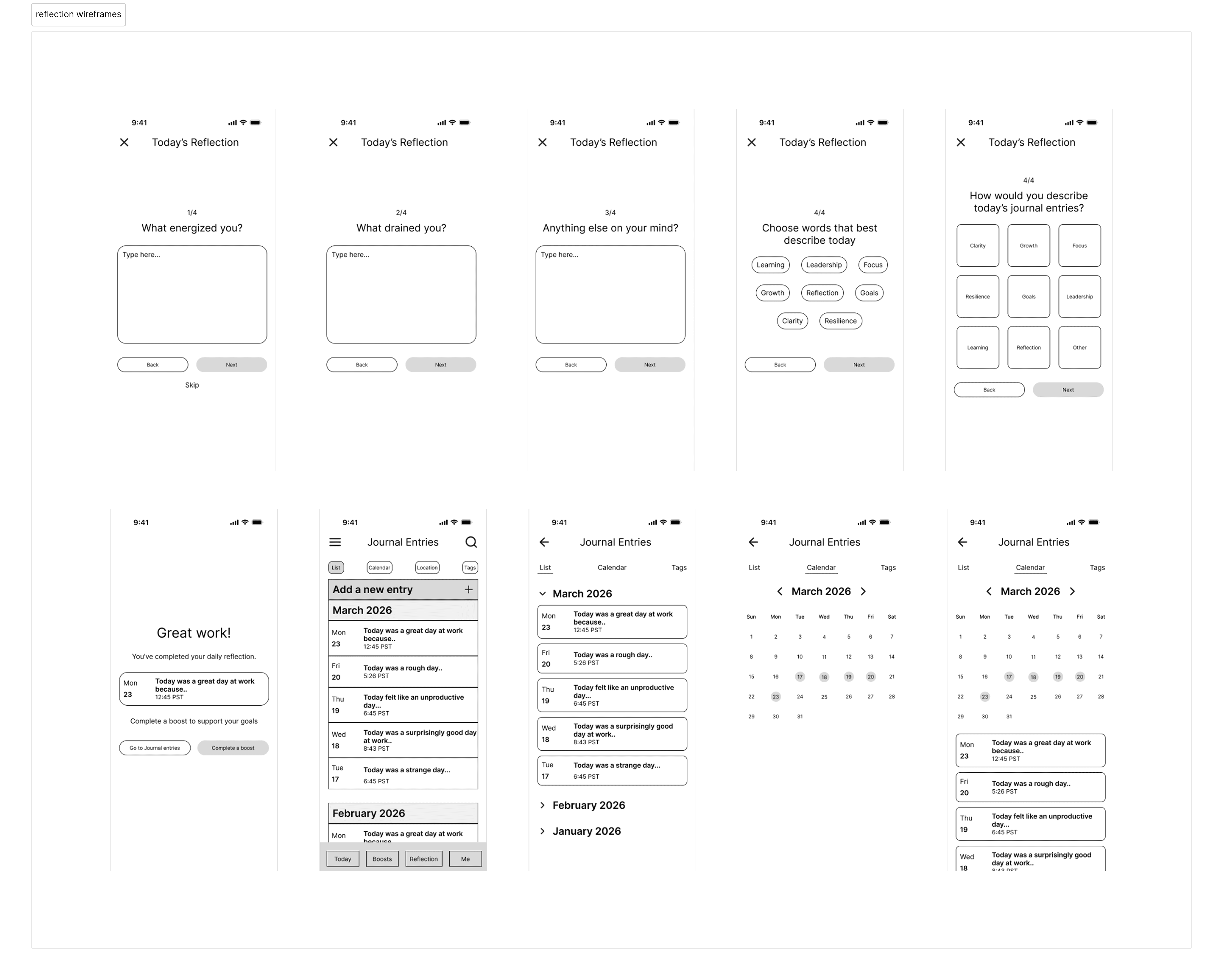
Reflect on what drives you
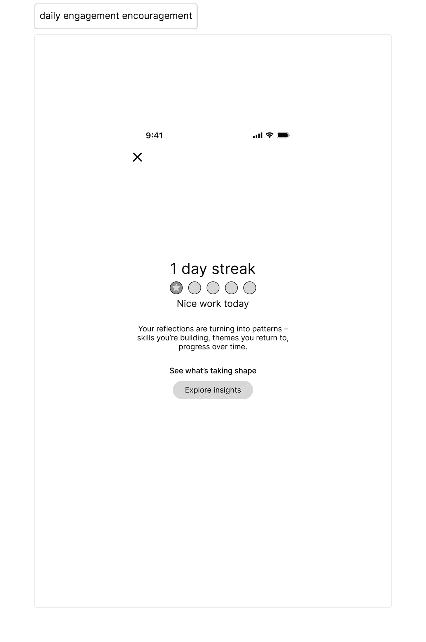
Users can complete quick daily check-ins to identify patterns in what energizes them or drains them, turning self-reflection into actionable career insights.
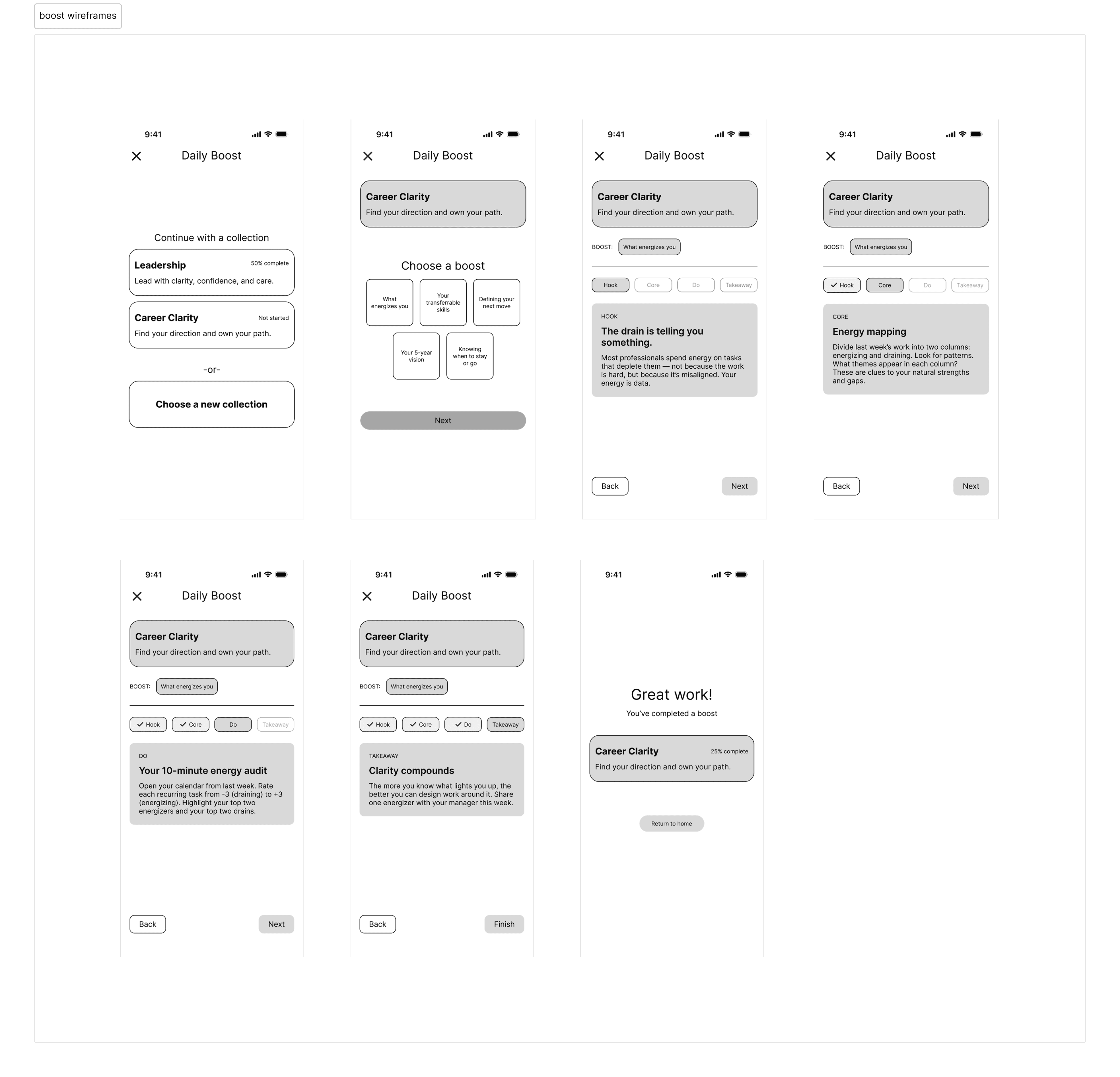
Build skills in small moments
Boosts make professional development feel approachable by helping users strengthen soft skills through quick, digestible exercises.
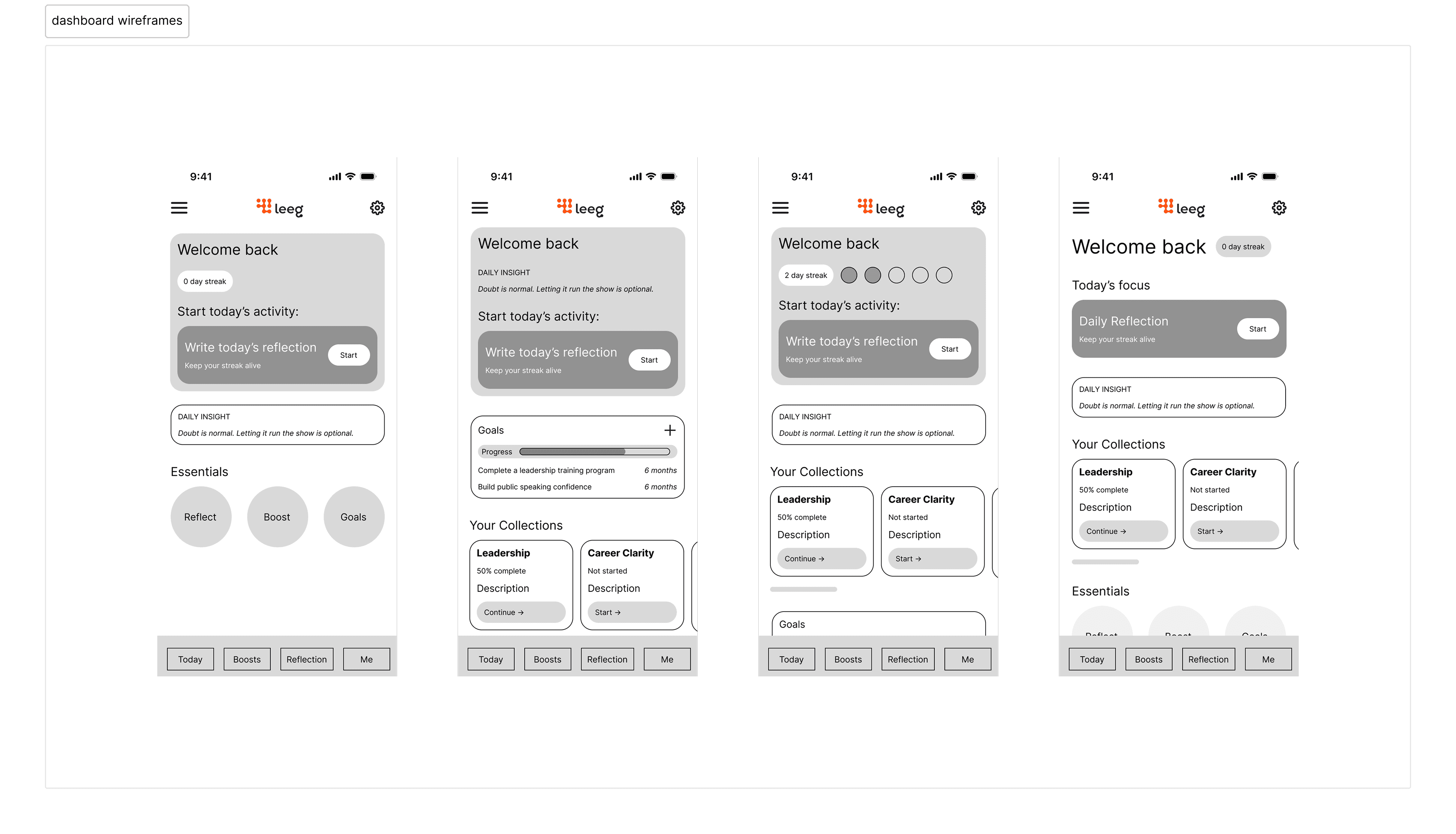
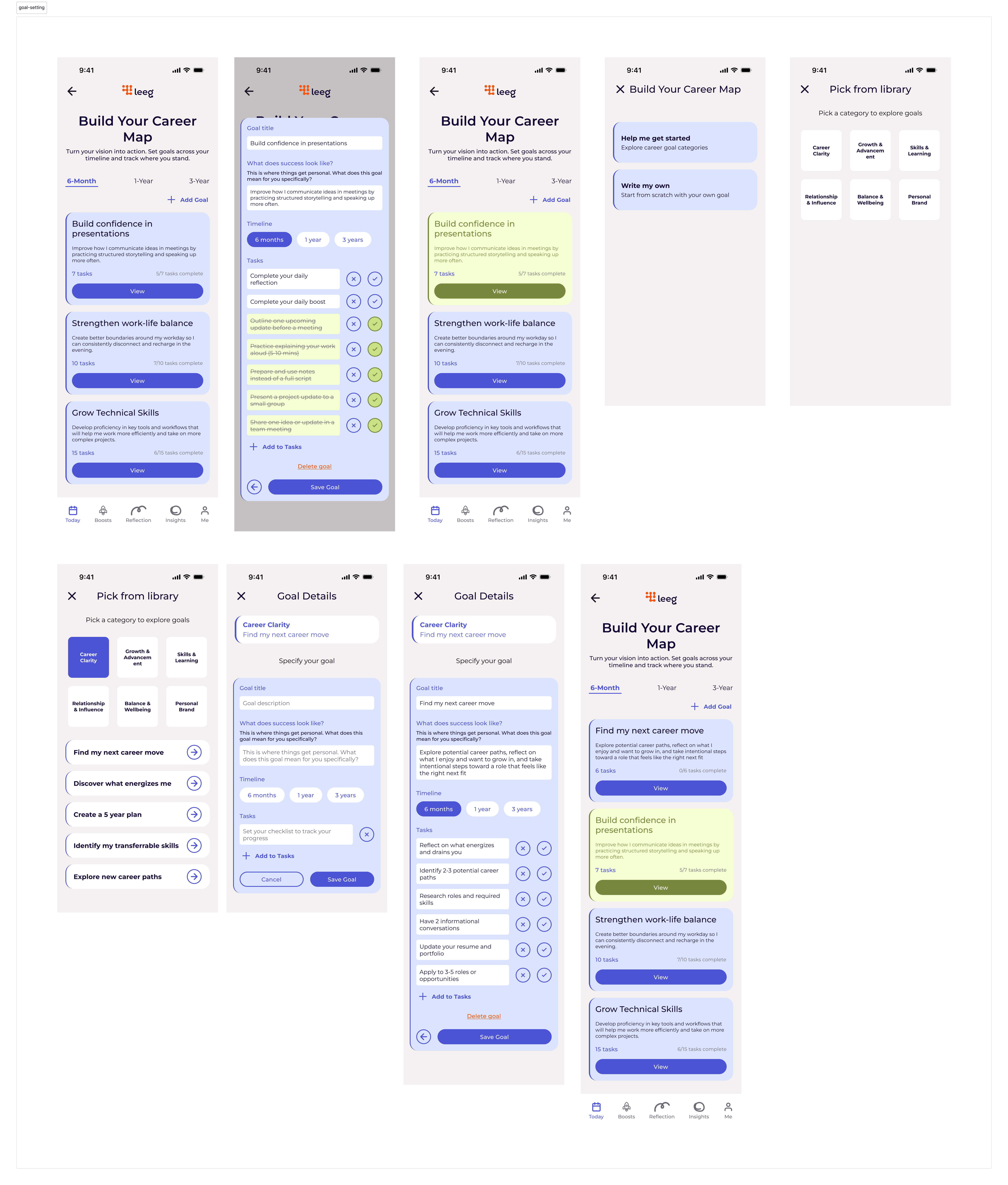
Turning ambitions into actions
Users can organize long-term goals into manageable milestones and tasks, creating clearer direction and accountability in their career growth.
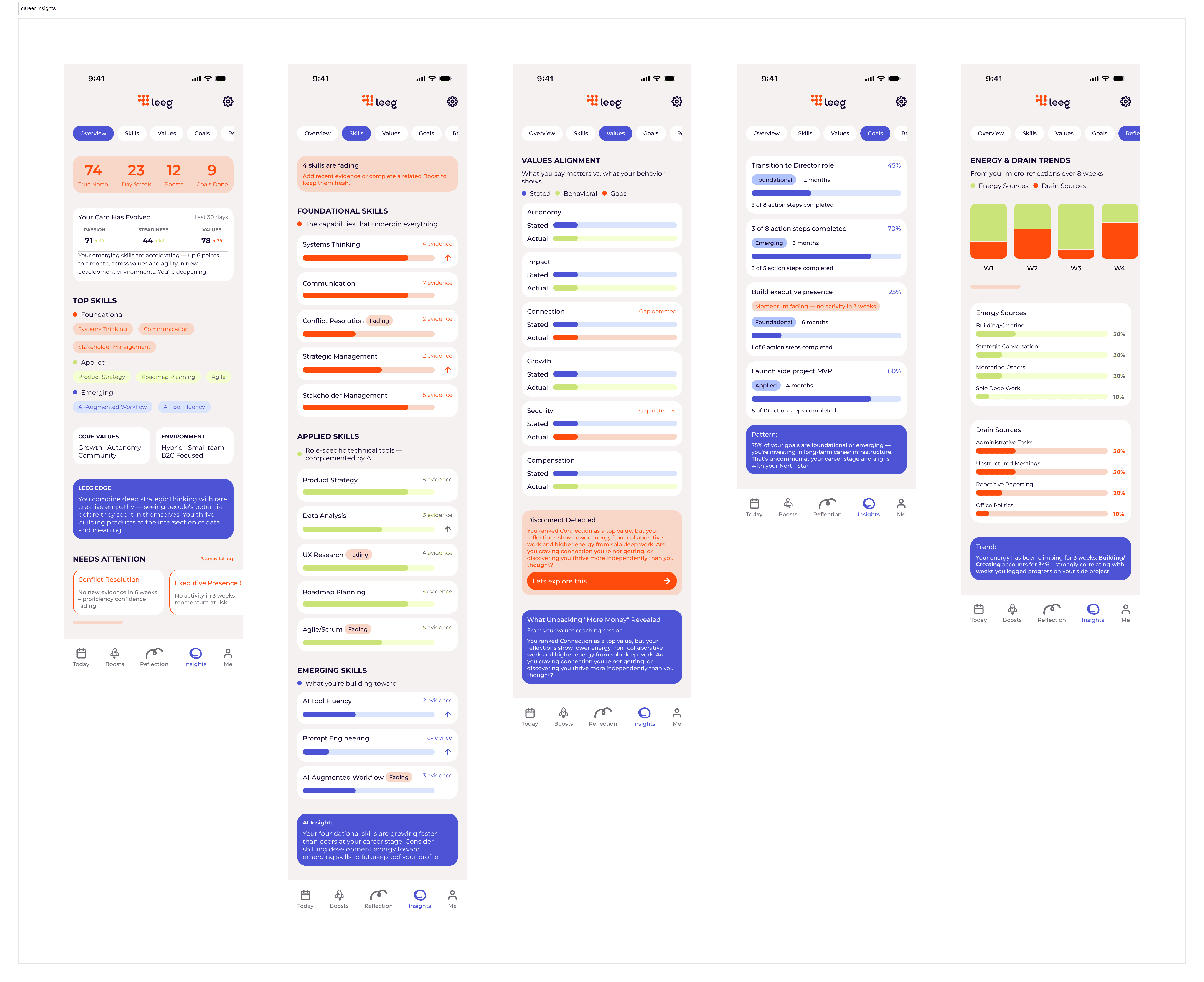
Understand your professional growth
Personalized insights visualize users' progress over time and provide guidance on areas of strength, improvement, and future development opportunities.
Reflection
One of the biggest surprises of this project was the level of ownership we had over the design direction. Working within Leeg's brand identity, we were given significant freedom to shape the system and make the changes we believed were necessary. That trust pushed us to be more intentional about every decision we made.
This project was also an opportunity to incorporate AI into our workflow, using tools like Notion AI, ChatGPT, and Claude to accelerate documentation and research synthesis, freeing up more time for strategy and design.
Ultimately, this project reminded me that good UX is less about adding features and more about making what exists feel inevitable. The best decision we made was gounding our design decisions in the idea that users should never have to wonder what to do next.